woah another bulletin board kit has arrived! and um it's even better than the Rosie one imo!!
So excited to show off the latest one in the shop with y'all. I just love the color palette. We went with jewel tones on this one. I love the colors - white (like a pearl), silvers, gold, and rose golds - and I think they make it just that much better.
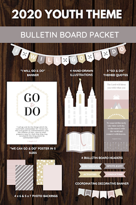
But in addition, there are just so many features in this packet and they are beautifully designed. This one has a minimalist theme. We stepped up the poster it was based on a wee bit and then created all of the supplements to the main design. There is seriously so much value in this packet -- 5 poster sizes, 8 photo backing designs, 2 banners, 4 illustrations, 4 headers and 5 different "go and do" poster designs. Overall, 25 design elements. Look at me math-ing!
See everything included? I just love looking at these colors! You can use as little or as much of the packet as you need or want, depending on the size and shape of the bulletin board you're needing to fill. I am making 2 more kits, but we have already planned on using this one for our ward bulletin board. It's so cute and ugh, love it. It also allows us to make some posters in different languages for our diverse group in the ward of YW, which I will be releasing soon as a freebie. So excited to share a printable in Spanish, French & Portuguese!
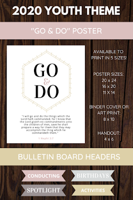
The main part of the bulletin board is its central poster. Again, as you can tell, it has been stepped it up from its "roots" lol. I was looking at it, and I was like "uh, we just have a blue ampersand in the middle and that is NOT a color palette" and so we added on a few elements and have the improved poster in 5 sizes for you all.
Below it, you can also see the headers. These are great for organization. I used to be in charge of our YW bulletin board as a value project, and I had 2 envelopes: one with headers and then another with everyone's names in a cool font. Thinking back to it, I was a young Beehive and it probably looked terrible, but it was a pretty good concept. All I did each month was keep up the headers, but switch out what was under them, which was in the envelopes and already printed.
In our ward, first of all, we only have one class, but second of all, every Sunday we meet together to say the theme, prayer, and the announcements as detailed in the curriculum. (You know, like "who is missing, what's going on, etc) The question is "which class presidency member is doing this for the month?" This is what you can use the conducting header for, if that is how you do things.
And the other headers are pretty straightforward. It's so funny, the grey one almost looks blue in comparison to the other colors. Heh heh. Anyways...
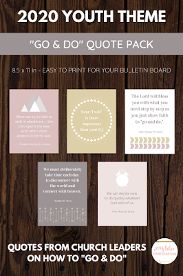
Then we have these quotes from church leaders. After rounding up the best out of like a 20-quote "go and do" list, I narrowed it down onto these 5. My favorite is maybe the arrows one. This isn't really my usual style. I almost never use clipart & fonts in designs like these where it's just visual -- I usually opt for hand-drawn illustrations and hand-lettered calligraphy (by me hehehe), but this isn't the purpose of the packet.
It's a minimalist theme, with simple & classy design, and... not that many visual elements. Aaah. But to my surprise, even though I diverted from how I usually do things, they ended up looking very cute. Love it! I'm just glad I wrote the correct size for them. A few days ago I noticed that I had accidentally written "8 x 11.5" for another packet's go & do posters and I was like "oh dang Claire you just invented a new poster size...😂😬."
And all of the fun stuff to make it prettyyyyy! I love these illustrations, they are all so cute. My favorites are the scriptures & temple. It's a little hard to see the colors since they are light, but you can click on the image and really look at them if you need to. There are 2 banners. What I like about the "I will go & do" poster is that you can have it as the full phrase OR just have it as "go & do" if you're a lil short on space. And then there are the photo backings, which are slightly bigger than 4 x 6 or 5 x 7 and great for photos of the YW obviously. You could also do them diagonally behind the photo as well.
If you are just hoping for a free printable and don’t need to buy a whole packet, I have a bunch of 8 x 10 posters for the “go and do” theme! Check out all 7 (I think it is? 😂) here.
That's it!! If you enjoy, you can get the packet as a digital download over here. Hover over any image (or click on it on your phone) to Pin it for later. Be sure to follow me on Pinterest or favorite my shop on Etsy. Best of luck with your 2020 planning!



)))))%20(13).png)

No comments:
Post a Comment